Showing posts with label Jane Tregenza. Show all posts

Sunday, April 30, 2017

Excerpts from the Diary of a Designer Volume # 5

Wednesday the 19th of April 2017

Dear Diary...

What a week!! I honestly have NOT fully recovered from Easter yet...
It was a typical Easter this year, full of kids, fun, stories and chocolate. 

As I do every year I swear I'm not going to touch chocolate, and as it does every year, the temptation gets too much for me and I end up eating all the chocolate I can find!! 
[rolls eyes in exasperation]

Opps...


I dont know why Easter has to look and smell so good ... and a bunch of kids running around  me all day munching on chocolate statues of rabbits is just a tad too 'in your face' for me to cope with ... in any case ...the great chocolate binge of 2017 is behind me now and I'm doing my best to keep busy in its wake... 
now lets  never speak of that particular incident again!

Scrapping as always is my favourite solace during these trying times and today I spent a blissful day creating this simple layout using Basecoat 4 papers from Kaisercraft and Imaginarium Designs chipboards...


Oh how I adore these simple little frames that add so much to a layout with such little effort.
I've simply run over the chipboards with a white pen and added them to the page :)


 Variegated colours for titles is my favourite way to treat larger styled chipboard words :) 


Another day .... Another layout ... I love the simplicity of creating ❤


Thursday the 20th of April 2017

Dear Diary...
I was up early today with lots of extra energy ... I love days like this when inspiration strikes and you can get straight into a project :) The children are all on holidays so the house belongs to them again and I just try to keep out of their way.... so it's off to my workshop to scrap, today I had an idea for tearing a circle into paper I just couldn't wait to try...

Using Kaisercraft Sage and Grace papers, some beautiful lace and Imaginarium Designs chipboards I  got stuck into this page...


Another simple title and flourishes where I've just added the colour with ink and then gone back over one edge of the letters with a white pen to create shine lines.


Friday the 21st of April 2017

Dear Diary...

Oooohhhhhhh ..... I'm so excited today ... I was up before the sun and couldnt wait to get to work using these new papers from Kaisercraft .... Bombay Sunrise!
These papers were made for me ... I LOOVVEEEE all the bright colours and vibrancy of it all... on a side note, I did actually spend a couple of months in India back in my uni days and this really is what the colours of an Indian sunrise ( and Sunset for that matter) looks like over the great cities of the plains ... simply breathtaking! 


I used these 'Loolabelles Frame and Bars' (12 inch) from Imaginarium ... I inked them first, chopped them up then constructed them on the page .... man did I feel tricksy after that move!! 


I didn't treat the chip board with anything other than simple colored ink as there was already a whole lot going on in this layout ... but I was thrilled with the end result :) 


 Then I jumped straight into this second layout doing pretty much the same thing with ink and the gorgeous papers. I used an unconventional title this time ... I know 'Bundle of Joy' is meant for a baby ... but hey it worked here so I thought go for it! 
Using unusual chipboard titles is one of my favourite things to do :)


Saturday the 22nd of April 2017

Dear Diary...

Today I'm MAD EXCITED ... 
I'm heading up to Brisbane today to do a Jane Tregenza Patchwork Panels Class with Alison Bevis ... and then tomorrow I'm teaching and hanging with some of my Imaginarium Designs DT buddies ... how much fun can one person have?

...but before the fun comes the work 😔

I'm teaching how to make a quick and easy box card and there are 50 people in the class so I had better get working ... I want to have most of the cutting and crappy boring work done for the ladies so they can just concentrate on getting on with the card :) so I'll be cutting over 750 bits of paper up today and packing them.

Imaginarium Designs has turned out to be 
THE BEST DESIGN TEAM I'VE EVER WORKED ON
When I told them about the kind of chipboards I wanted to have to use on this card they designed me my very own unique board ....


I'm feeling a tad chuffed about this board... it's like having another baby ( but without the messy bits obviously) ... my very own board created by me for my box card design! 

I still cant believe how accommodating Imaginarium Designs are.... apparently this is something they can do for large enough orders ... I'll be back for sure :) 

I actually had tones of these made up and am selling them on my WEBSITE for $5.99 ...
I expect to sell many with the free postage.... I may even be rich one day!!? just sayin 😄


Sunday the 23rd of April 2017

Dear Diary...

WHAT A HUGE FUN DAY!!!
Today I taught at the Imaginarium Designs ACE class ( Alison's Craft Events) along with Jane Tregenza, Sue Smyth and hosted by Alison Bevis.... sooooooo much fun :) 

This is the quick and easy box card I taught...


I started out the day with a headache thanks to small incident with some pineapple lumps the day before... Alison warned me to stay away from them ... but I have a problem with this particular food group... so my 'After Easter Resolution' to never eat chocolate again only turned out to last 6 days ... 😐

For those who don't know what Pineapple Lumps are.. they are quite simply 
THE BEST TREAT EVER!!

Water and Panadol seemed to deal with the sugar headache quickly and we had an awesome day in the end .... Sue Smyth actually used a meat cleaver ...A MEAT CLEAVER!! in her class ... that was impressively noisey!!  

Here is a photo of everyone hard at work ...


This is Sue and I (and Wendy the photo bomber)  while class was going on behind us.
It was a wonderful day and the projects were fabulous ... Sue taught how to cleverly embellish a journal, Jane did a stunning double layout and I did the box card .... there was more Imaginarium chipboards consumed today than pineapple lumps yesterday... which is an impressive amount!! lol


I can't believe it's Monday tomorrow.... it's just as well though
... I'm looking forward to heading back to work for a rest! 😉


_____________________________________

Kelly-ann Oosterbeek has been a scrapbook and paper craft designer for the last 17 years and lives in Northern NSW with her super-sized family.

She has her own line of gloss finish butterfly stickers ( featured on the projects in this post), and sells these along with Kaisercraft Collections and layout kits online ...

www.kellyanno.com



http://www.kellyanno.com/


Thursday, April 19, 2012

Three different Layouts, three different looks

Today I have some more layouts to share with you all if you are needing some more inspiration.
First Heather has a lovely layout for you. Her layout looks simple but she has done quite a bit to her cardstock before she even started working on her layout.


Heather has used a mask with ink to give the chicken wire look to her layout.

IDP0036 Wishing You Happiness

Heather has this tip to share "I cut the branches in two and used each piece separately on the page ...one section is attached to the top right corner and the other is layered with the twigs"
 Heather always uses stamps on her work and always does some pen lines. Heather inked all her chipboard with Raspberry Versa color ink.


IDFL0013 Twig (2 on a Board)

Heather's handy tip...
Most of the chipboard can be cut into sections and used creatively as I have demonstrated on this page ... experiment with your pieces and you will be amazed how versatile these chippies are .

other items
white bazzill card
kraft card
Raspberry Versa color ink
Crafters workshop mask
Velvet flowers – Megs Garden
bumble tags
stamp by MAGENTA  made in Canada
What a lovely layout from Heather, thanks so much for sharing with your page with us. To see more of Heather's work, visit her blog.

The next Layout is one from Adriana. I love the photo she has chosen and how she has worked her page around it. There is a lot to look at on this wonderful page.


Adriana's layouts always look lovely, with lots of little bits and pieces to take in. She has done some punching along one edge of her page. I love the finish on her chipboard, she has inked it and added some glossy accents to make it shiny.


IDFR0003 Swirly Frames 6x4 inches


IDAUC0001 Capital letters

I love the way Adriana has layered her chipboard title on top of each other. She has used the alpha's and layered a word on top. Again she has inked them and added glossy accents.
Once again a lovely layout from Adriana. To see more of her work visit her blog.
The last layout is from Me. This is one I did for Graphic 45. I have a tutorial on my blog for making this layout if you want to have a go.

It is a page I did on my son. He traveled with me to the USA early this year. We spent a day at Disney Land and we went on the "mad hatter ride"  Josh worked out that if you turned the wheel faster the cup span faster. He had great delight in turning the wheel as fast as he could and watching me turn green. I love the way the photo has captured the movement of ride in the back ground. I painted a clock black and layered another title cream and glued them on top of each other.


IDS0006 Clock face (3 Inch)


I used papers from Graphic 45's olde Curiosity shoppe. I used 3L adhesive tape runner and foam tape. I also used 3L black photo corners. I love these and I used them by the packet full.
I have a thing about clocks, I used them on lots of my projects.
To see the tutorial on making my layout then visit my blog
That's it for today, please leave a comment and go into the draw to win some chipboard.
Have a great weekend
Jane


Thursday, January 12, 2012

Introducing the Creative Jane Tregenza


cre·a·tive
adjective
1.
having the quality or power of creating.
2.
resulting from originality of thought, expression, etc.; imaginative: creative scrapbooking.


I am  design team leader for Imaginarium Designs and get to design chipboard for them as well. I am really loving this new direction for me. The chance to design chipboard products to be used by fellow scrapbookers is a dream come true and great fun.
I  am looking forward to showing you my Creative projects this year. 
Here is a bit about myself.


 I am still happily married to the same wonderful man (coming up for 30 years)  and the busy Mum to 5 wonderful children. I have been scrapbooking for over 7 years. I am the owner of my own scrapbooking store Seriously Scrapbooking. I teach 10-15 classes a month in my store. I also teach master classes to other teachers and store owners Australia wide. Last year I was a guest teacher at one of Australia’s biggest scrapbooking expos and have been invited back again this year. I love teaching and sharing my love for scrapbooking with others, hearing their stories and sharing mine. One of the other  joys of scrapbooking is the people you meet. I now have a wide circle of friends from all over the world that scrapbooking has introduced me to.  I have had my work published in Australia and USA. My style  changes depending on who I am designing/working for and what products I am using. With my work the photo must be the focus. I like straight lines and everything needs to line up. I love layering papers and embellishments to get just the look I want.  I have been known to throw away a page and start all over again. For me, I have to be really happy with the finished project. If I don’t like it, I won’t use it. I am a bit of a perfectionist when it comes to scrapbooking. I like to hide things on my page for people to find who take the time to really look.  I am very delighted and honored to be on  Graphic 45’s Design team for a second year.


To see more of my work visit my blog.
Jane Tregenza  Jane Tregenza


Please leave a comment welcoming Jane,

Wednesday, November 16, 2011

Tutorial by Jane.....

Australian Scrapbook Ideas ask me to do a feature for their October Magazine.
They asked for three layouts with a Paris theme. I hope to visit Paris one day but as yet have not made it. So it was a case of asking friends for their holiday photos.
Graphic 45 are featuring my work on their blog along with some photos of the Graphic 45 Ladies trip to Paris early this year.
Make sure you visit their blog and leave a comment to go into the draw to win their weekly prize.
Also leave a comment here on mine {HERE} and I will choose someone to win a set of Eiffel Tower chipboards.

I love this layout of the Eiffel tower. I love using lots of layers on my work. I like to think that each time you look at it you find something else. As it has lots of layers and elements you need to be careful when following my instructions. I always measure twice and cut once!

Just Paris
1 - Cut your cream bazzill to 27.5cm x 27.5cm and tape it to the middle of your “Curtain Call” print paper.
2 - Cut your black Bazzill to 25.5 cm x 25.5 cm and adhere it to the middle of your cream Bazzill. 3 - Cut Postage print paper to 24.5cm x 24.5 and adhere it to your black Bazzill with photo corners.
4 - You need to cut two elements from “the Cinema” print paper. The first one is the film strip with the images on it. Cut it the whole length and then trim it back to 24cm long and mat it with black Bazzill. Cut a narrow piece of black Bazzill 4cm wide and tape it on top of the film images. Add gold sticky ribbon to the middle of the black Bazzill and in the middle. Once you have cut out this piece, cut the film strip with numbers on it, you will need to use both pieces. Mat the two pieces with black Bazzill.
5 - From the sheet you will need to cut the image with the couple with the man with a sword, leaving some of the black edge on it. Cut a piece of cream Bazzill 7.5 cm x 15cm. Mat this piece with black Bazzill. Add the image of the couple to the middle of the cream Bazzill. Cut a small piece of the print paper to 2.5cm wide and 10cm long. Back tear along one edge of it, along the long side and ink. Attach it to the bottom of the image piece and wrap edges around to the back. Add black ribbon over the top and wrap a piece of organza ribbon and tie it to the front with a knot to the right side of the piece.
6 - Cut a piece of yours truly to 5cm x 9cm and adhere it over the top of the couple using black photo corners.
7 - Ink Paris title and Eiffel tower with black ink. Place Eiffel tower on to cream cardstock and draw around it and cut out the shape. It needs to be a little bit bigger than the chipboard shape. Glue the two together and attach it to the red print with foam tape as shown. Add clock to the middle of Eiffel Tower.
For the rest of the page:
1 - You need to adhere your print paper stripe with gold sticky ribbon to the bottom of your print paper; it needs to be about 4cm up from the bottom of the print. Place two pieces of film strip with numbers on an angle running from the top of your page to the bottom attach them to each other. Once happy with the angle you can tape them down.
2 - You can add your rectangle with the Eiffel tower to your page using foam tape. Use the photo of the layout for a guide for placing it.
3 - Cut three Eiffel tower stamps from your Tour de France print paper and mat them with black Bazzill. Adhere them on top of the number film strip at the top of your page. The left and right one go on with tape but use foam tape on the middle one.
4 - Punch a circle of black Bazzill and adhere your bottle cap disk on to it. Push it onto the memo pin. Tie a piece of organza ribbon to pin and insert into the foam tape at the top of your rectangle piece with the Eiffel tower.
5 - Check that your matted photo will fit and adhere it to your page using photo corners.
6 - Add title and brads to finish.
Tip Use photo corners on your work to give it a classic look. Use lots of elements to add interest and layer elements using foam tape to add dimension.
Supplies:
Graphic 45Graphic 45 Curtain Call Collection - Curtain Call G4500317Graphic 45 Curtain Call Collection - Tour de France G4500324Graphic 45 Curtain Call Collection – the Cinema G4500323Graphic 45 Communique Collection – Postage G4500067Graphic 45 Domestic Goddess Collection – Yours truly G4500124 Imaginarium designs chipboard Paris Title IDW0040, Eliffel Tower IDS0041,

Other 2x Cream Bazzill 2x Black Bazzills, 3L Photo corners, Green Tara gold sticky ribbon.Vandoros black ribbon and Gold organza ribbon, Clock, Tim Holtz Memo pins, Bottle cap Images Paris Passport, Making memories decorative brads, Foam tape, double sided tape and glue.

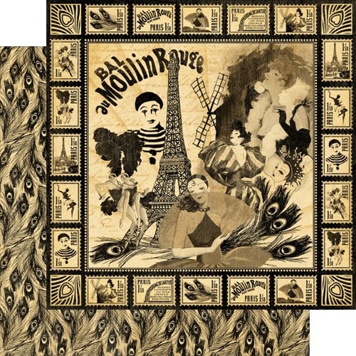
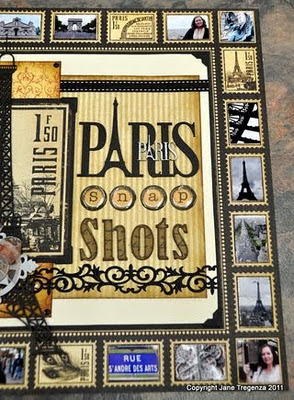
Snap Shots of ParisFor this layout I ask my "Friday fortnight friend" Debs for some of her photos. She had just returned and had 100's of photos. This meant I had lot of photos of Paris to play with. I decide to do a whole layout using as many photos as I could. I love this print paper “Moulin Rouge” from Graphic 45’s Curtain Call I decided to use it as the background paper for my layout.
I printed all the photos in a small size and cut them to fit the stamps which were printed on the paper. I had beautiful Eiffel tower chipboard from Imaginarium designs and used it as the centre of my layout. The page came together really well and shows 20 snap shots of Paris
1 - Using Graphic 45’s Moulin Rouge as your base. Work out how many of the squares you want to cover. I left 4 squares uncovered without any photos. Cut the photos to 2.5cm x 3.6cm, + four photos 2.8 x2.8 cm for the corners. Lay your photos on the squares and move them around until you are happy with the layout. Once happy adhere them to the page.
2 - Cut your black Bazzill to 22.1 cm x 22.1 cm and tape it to the middle of your print paper. It should fit nicely inside the square. Cut your cream bazzill to 21.5cm x 21.5cm place tape in the middle of the paper and adhere it to your black Bazzill. Don’t tape down the sides as you will need to wrap ribbon around the edges later on. Add photo corners to the cream corners and stick them down.
3 - Cut your Tour de France print paper to 15cm x 19cm with the stripes running down. Ink around the edges and adhere it to your cream Bazzill with the same amount of space at the top and bottom and 1cm in from the right side of the cream bazzill. Add a piece of black stitched ribbon across the top of the stripe and wrap it around to the back of the cream on the right side of the page.
4 - Cut your Paris Post print paper to 9cm x 20.5cm and adhere it to the cream Bazzill over the top of the stripe and ribbon. It needs to go 1 cm in on the cream from the left side with the same amount of space at the top and bottom. . Add black brads to each corner.
5 - Add some sticky ribbon across the page over the top of both print papers and wrap it around the back of the cream on both sides. Use the photo as a guide as to where to place it.
Cut the Eiffel tower print from your tour de France paper and mat it with black Bazzill. Add four photo corners and attach to the page as shown (above).
Ink Eiffel tower and Paris title in black. Paint the miniature title and Edward ornament with a silver paint dabber. (use the photo below as a guide)

1 - I used some alphas, which I inked with vintage photo distress ink and stamped with a French writing stamp and black ink over the top.
2 - Push out the circle letters from the Domestic Goddess to spell “snap” and place an epoxy dot over the top.
3 - Once the silver paint is dry, glue the tinies Paris title onto the black title.
Tie a ribbon through the “wander” disk and glue it to the middle of the painted Edward ornament.
4 - Place all the titles and the Eiffel tower to your page and check that all the elements fit. Once you are happy, glue the Eiffel tower down to your page and glue the silver element to the Eiffel tower. Glue title and words to your layout.
Supplies:
Graphic 45Graphic 45 Curtain Call Collection - Moulin Rouge G4500325Graphic 45 Curtain Call Collection - Tour de France G4500324Graphic 45 Domestic Goddess Collection - Alphabet G4500131Graphic 45 Curtain Call Collection - Tour de France G4500324Graphic 45 Transatlantique Collection - Paris Post G4500090

Imaginarium designs:Paris Title (E), IDS0041 67mmx93.5mm, Paris Title Tinies IDT0024, Eiffel Tower Large IDS0040, Alphas Lowercase IDALC0001, Alphas Uppercase IDAUC0001, Edward Ornament IDFL0012 (2 per board)

Black Bazzill, Cream Bazzill, Tim Holtz Philosophy Tags “wander”, 3L photo corners, Large Epoxy Dots, Black Doodle Bug Brads, Green Tara Black sticky ribbon.Vandoros black stitched ribbon and copper organza ribbon.Double sided tape, foam tape and glue

The Paris Opera House.

For this layout I ask my special Friend Meg for some of her photos. Her husband Dave took the photos. Once I had copies of his photos and saw this one I was captivated. I love this photo, it shows the glorious rich colours and the opulence of opera house, which was part of the great reconstruction of Paris during the second Empire initiated by Emperor Napoleon III . The Opera house was started in 1861 with the laying of a foundation stone. Legend is that the Emperor’s wife Eugenie asked the architect whether the building would be built in the Greek or Roman style to which her replied “It is in the Napoleon III style, Madame. It was the setting for Gaston Leroux’s famous novel “the Phantom of the Opera” written in 1910. Andrew Lloyd Webber used it as a guide for the sets of his movie based on Leroux’s book. I decided to keep the layout simple as the photo is so beautiful. I printed the photo twice in different sizes and placed them on top of each other to make them the focus of my layout.
1 - Use a 12x12 black bazzil as base for the layout.
2 - Cut a piece of cardboard to 11 ¼ x 11 ¼
3 - Cut your print paper to 11 ½ x 11 ½ and ink around the edges. Tape the cardboard piece to the back of the print paper. This will raise your print paper up a bit from the black Bazzill.
4 - Mat your two photos with black Bazzill. Add more cardboard to the smaller photo on the back and add foam tape to the cardboard. This will raise the smaller photo up when it is placed on the larger photo. Now you can stick your smaller matted photo on top of the larger photo.
5 - Cut the Ephemera extraordinaire to 6 ¼ x 8 ¼ and cut a black mat 6 ¾ x 8 ¾ adhere the black mat to the back of the print paper. Adhere your layered photo in the middle of the print paper. Don’t stick it to your page just yet.
6 - Ink one of the “Paris” titles, “opera house” titles , the word “the” and all four corners with black ink.
7 - The second “Paris” title needs to be inked lightly with Vintage photo. I used a sponging block to add the ink to the chipboard rather than applying the ink direct from the ink pad to the chipboard. This helps me control the amount of ink I apply, meaning I can lightly ink the chipboard. Make sure you dry the inked title with a heat gun before embossing it. This is important as the gold powder will adhere to the whole title rather than just the stamped embossed part of the title. To finish the title I added some old French writing with gold embossed powder on top. To do this, choose a stamp with French writing or any kind of writing and use an embossing ink pad. Place the stamped title into some gold embossing powder and heat with a heat gun.
Once cold, glue the gold embossed title on top of the black one. Make sure they don’t line up as you want the black title to show underneath.
7 - The second “Opera House” title needs to be totally inked with embossing ink and placed in gold embossing powder. Heat and melt the powder, once it is melted and while it is hot place it back into the power and reheat. Keep repeating this until the title is built up and has a thick smooth gold finished. Glue the finished gold title to the matching black title – off set it and make sure the black title is showing underneath.
10 - You can place all the elements on the page and check that they will fit. Start by gluing the corners onto the page. Add a gold brad in the corners and through all the layers of the layout. Add the title at the top of the page. The photo can go on next. The Opera House title goes on last as it has to go over the photos and corners.
Supplies:
One 4 x 6 inch photo and one 5 x 7 inch photo
Graphic 45 Print Papers
Steampunk Debutante Collection Ephemera extraordinaire G4500262
Graphic45 communiqué Collection Postage G45000673
sheets of Black Bazzill
Tim Holt Distress ink – Vintage Photo & Black soot
Tim Holtz Embossing ink pad
Imaginarium Designs Sponging block, Ranger - Queens Gold embossing powder
Making Memories Gold Brads, Double sided tape, foam tape and glue
Imaginarium Designs Chipboard:2x Paris Title IDW0040,
Edward Corners IDC0008,Imaginarium Designs Custom words – Opera House. Extra Cardboard

Well that is quite a long post I hope you enjoyed it!

Don't forget to leave a comment here and and on Jane's Blog and I will choose one of you to receive a bundle of Eiffel towers and a title.

thanks for looking

Jane

Friday, October 14, 2011

Jane & Graphic45

Good Morning,
Graphic45 and Scrapbook Adhesives are doing a blog hop at the moment and have a look at what our very own Jane has created using G45 paper and Imaginarium Designs!


"I decided to do something very different for this blog hop. Our store has a Girls night in happening later in the month. This is a night to raise money for Women’s Cancer. We have asked everyone attending to wear a hat. I decide to make mine using Graphic 45 using the Once Upon a Springtime collection for a “spring hat”.  I am not a hat maker and I now know why hats are made of fabric! The Scrapbook Adhesive tape runner was magic for this project. I couldn’t use glue as it would be too wet and take too long to dry, also it would stretch the paper. The tape runner just made the job so much easier." -Jane Tregenza
DSC_0161
DSC_0138
I cut a large circle out of the paper and made small pleats in it around the edge using the runner to tape them together.

DSC_0143
I cut a strip of cardboard to fit round my head and again using the tape runner, taped the pleated circle onto the cardboard.

DSC_0159
I added a brim with pleats in it to add interest.

Next was to make the flowers. I have included a mini tutorial for anyone wanting to make the flowers
DSC_0150
The tape runner comes with the option to personalize your tape runner, what a great idea. I used some of Graphic 45’s paper to personalize mine. The piece of paper that I took out I used as a template to make the rose petals. “Waste not want not”
DSC_0151
So using your template cut out 3 petals from “Spellbound and 3 Petals from “Fairy Folk”.  Ink around all the edges both sides of each petal.
Using a paint brush, wrap the first of the darker print petal around the end and adhere with the tape runner.
Using a second dark Petal, spray around the top of it with water.
DSC_0154
DSC_0155
Put some tape halfway  down the middle of the petal and each side of the bottom of the petal and wrap it around the first one.

Repeat with the third dark petal and then repeat with the three lighter petals. You will need to pinch the petals to help them fit. Don’t worry if they tear as you can touch them up with a bit of ink.
DSC_0157
When finished your rose should look something like this! You could keep adding more petals to make your rose bigger if you want to.

DSC_0182-1
I made three roses and added them to my hat. I tucked some organza ribbon in green to lift the roses and to hide the end of the roses. I added two peacock feathers from Imaginarium Designs sprayed black and a hat pin to finish it off.
I couldn’t have made this hat without the tape runner from Scrapbook adhesives. It made the job so much easier and the finished project neater. If I had used glue it would have been everywhere! The tape seem to have lasted forever and I only ran out right at the end.
Supplies:
Graphic 45 Once upon a Springtime- Spellbound, woodland fantasy and fairy folk.
Scrapbook Adhesives – my Stik
Colour box ink – rouge
Imaginarium designs – peacock feathers
Ribbons
Hat Pin.
Thanks Jane!

And dont forget to leave a comment to win some FREE chipboard!

Check out our stockists HERE to buy Imaginarium Designs - we ship ANYWHERE in the world for real time postage costs! Just email us for a quote!