
Hello and welcome to the Imaginarium Designs blog, Leonie here, and today I thought I would share my tips on coordinating chipboard with Patterned Paper.
If you are anything like me you have a hoard of patterned paper in your stash and new ranges are coming out all the time and they're so pretty and you just have to have them, right?!
But when it comes to pairing up your patterned papers with embellishments, and chipboard in particular, how do you go about making them fit together?
When I start planning a layout using patterned papers and chipboard I have few standard tips that apply so that my papers and chipboard pieces compliment each other and fit together to make a page.
I have three pages to share today each showing a different way that you can colour your chipboard so that it will compliment the papers you choose to scrap with.
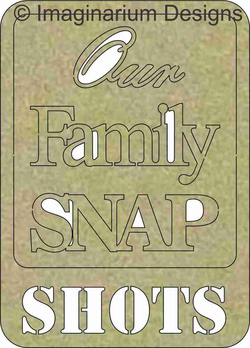
Our Family Snap Shots
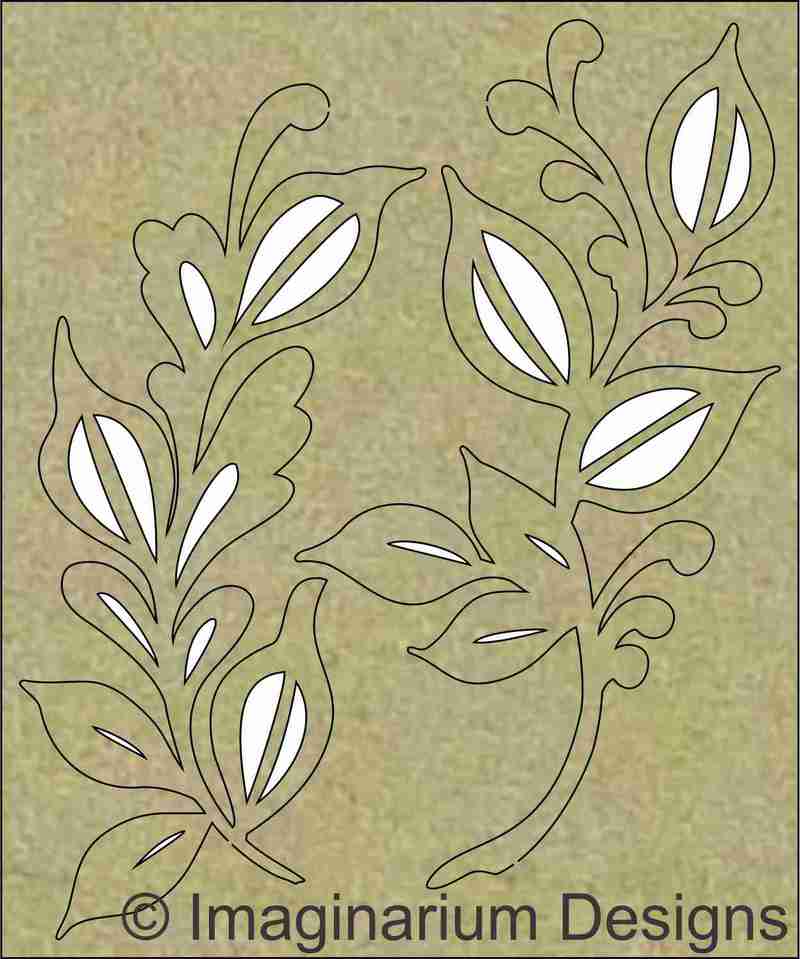
First up I have this page using the Wild At Heart Collection from Cocoa Vanilla Studios. How gorgeous is that marbleised pattern? But how do I go about matching chipboard with it?
I decided to pick out the main colours in the paper being the mainly pale pink along with pops of blue, yellow and deeper pink/red.

I painted the Family Snap Shots chipboard frame pale pink and the title pieces with Broken China Distress Paint by Ranger. In the close ups you can see I also added some Kindy Glitz to add some subtle sparkle to the page.

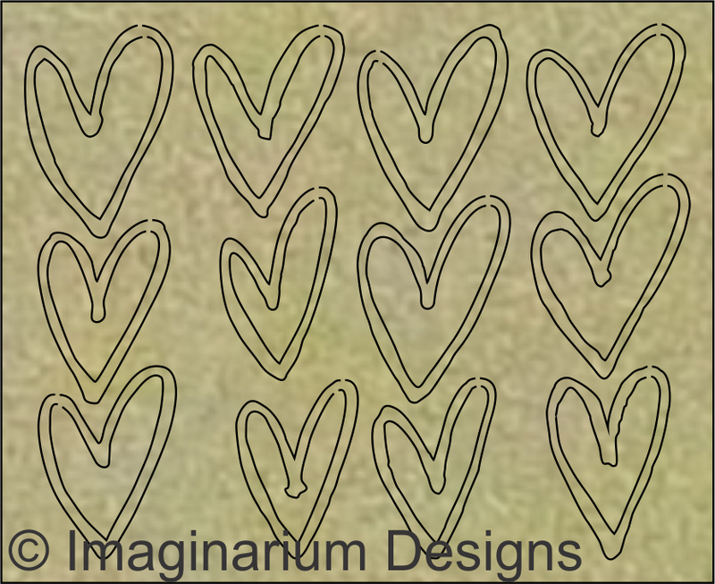
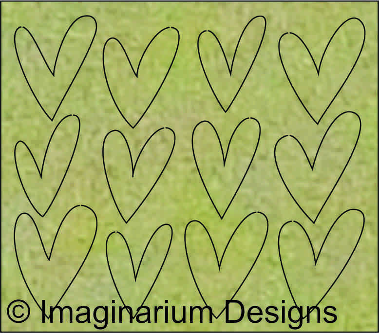
The pops of yellow from the paper I recreated in Nat's Hand Drawn Hearts using Mustard Seed Distress Paint.

The deep pink in the paper I repeated on the lovley flourish in my embellishment cluster again with Distress Paint, Fired Brick this time.

So you see by picking out several colours in your patterned papers and repeating them on your chipboard pieces it helps tie the page together.

You Are Amazing
My second method in blending chipboard and pattern papers is to look at the photo's I'm scrapping and choose a colour that stands out in some way. Look at your photo and who or what is in it? What are they wearing, what is the photo about etc.
In this case I had some photo's of my Daughter showing her sporting achievements. I could have gone with the red and blue in the photo's but I already had that covered in the patterned paper, so I decided to go with gold as the trophy was a gold colour and that's what the photo was about.

I then just painted all the chipboard - frame, arrows and You Are Amazing title with gold paint and even though there is no gold in the patterned papers because the photos have gold in it you can see that this ties everything together again.


Live For Today
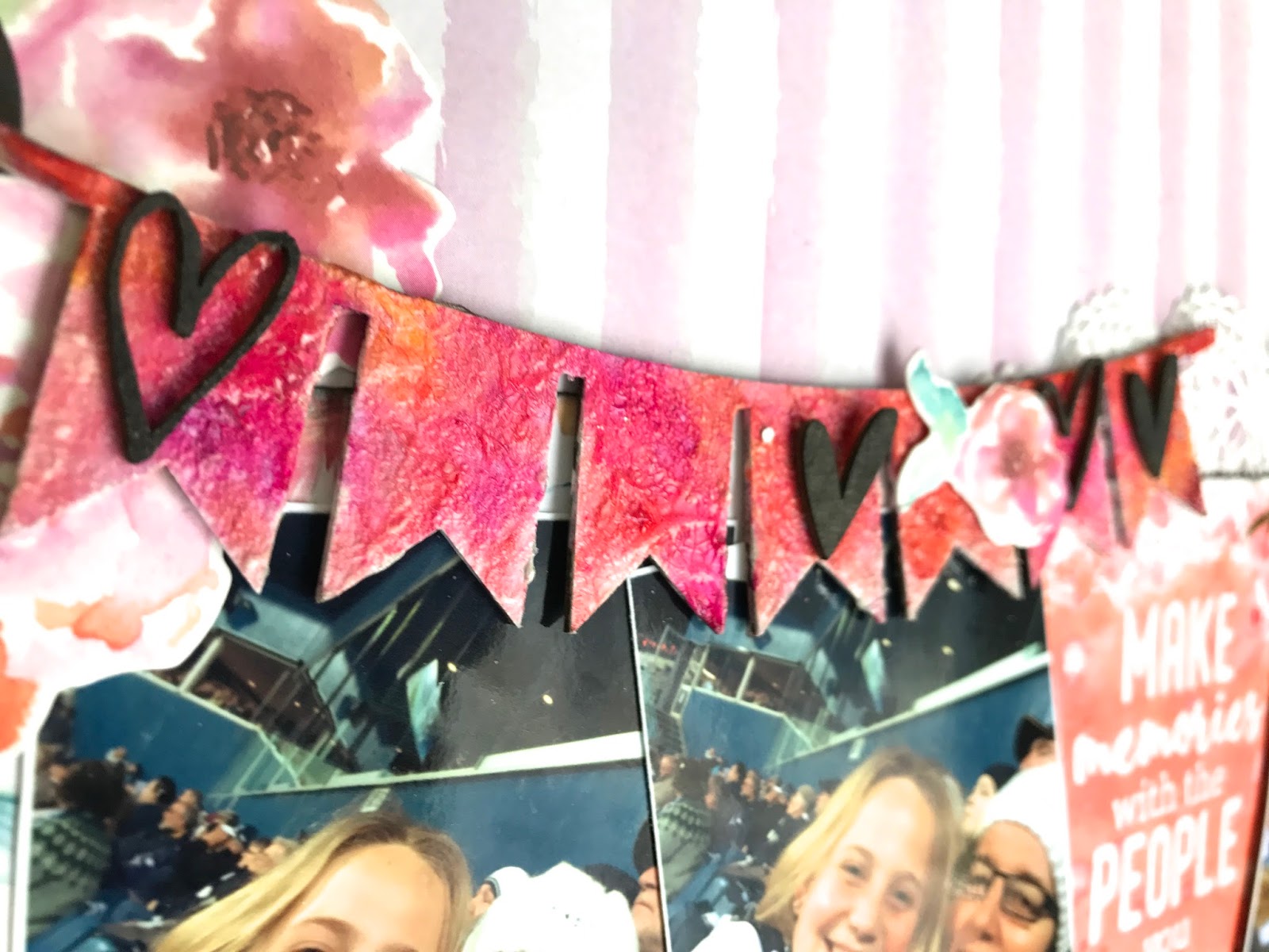
My third page today features Kaisercraft papers from the Wildflower collection. I chose to team it up with the Live For Today chipboard title, an Imaginarium Designs banner and some of those sweet hand drawn hearts again.
So in colouring my chipboard this time I used LuminArte Artists Pigments in the same various warm colours, shades of pink and orange in the papers.

In the close ups below you can see how adding similar shades to a piece of chipboard helps to compliment the patterned papers on the page.

I also added some clear crackle medium to the title chipboard and banner.

One last tip I have to share is adding contrast to your chipboard. When all else fails Black or white accents will save the day. In this case black works well against the coloured shades to make the hearts stand out on the banner.


So those are my tips,
1) Choose colours from your patterned papers to enhance your chipboard.
2) Choose colours from your photograph to colour your chipboard.
3) Chipboard coloured in Shades of warm or cool colours
that match your paper will help coordinate your page.
4) Black or White Chipboard will always add contrast to your page.
I know these tips may sound simple and often I think we do these things without realising it but I think it's good to refresh our memory sometimes with basic design tips.
I hope you've found this post interesting
Happy Crafting.
cheers!

Fabulous tips Leonie :)
ReplyDelete