
Hi all and welcome to the Imaginarium Designs Chipboard blog. Leonie Neal-Dawson here with two completely opposite pages. One bright and colourful the other soft and pretty featuring some wonderful chipboard pieces.
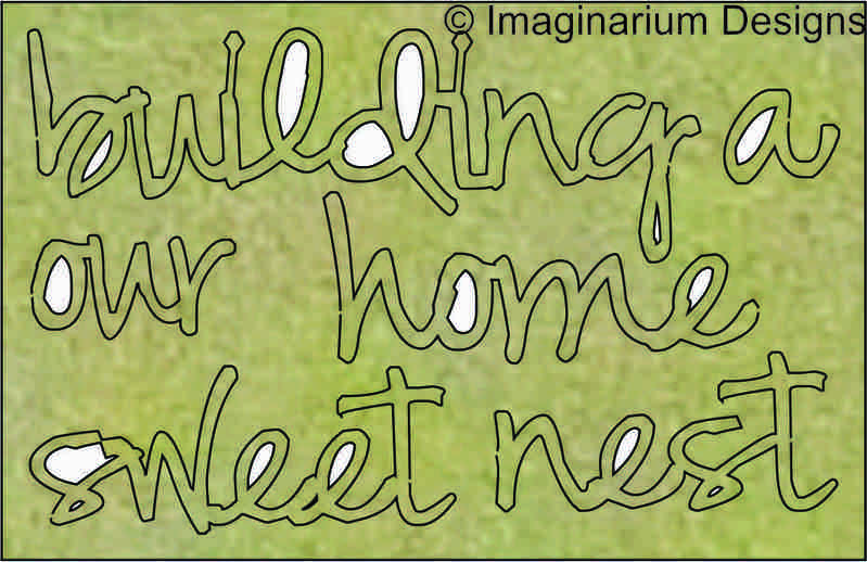
First up is this fabulously bright fun page titled 'Our Sweet Home'.

The background is painted with an array of colourful Dylusions paints. Keeping this in mind I painted the chipboard pieces black so they stood out on the page.
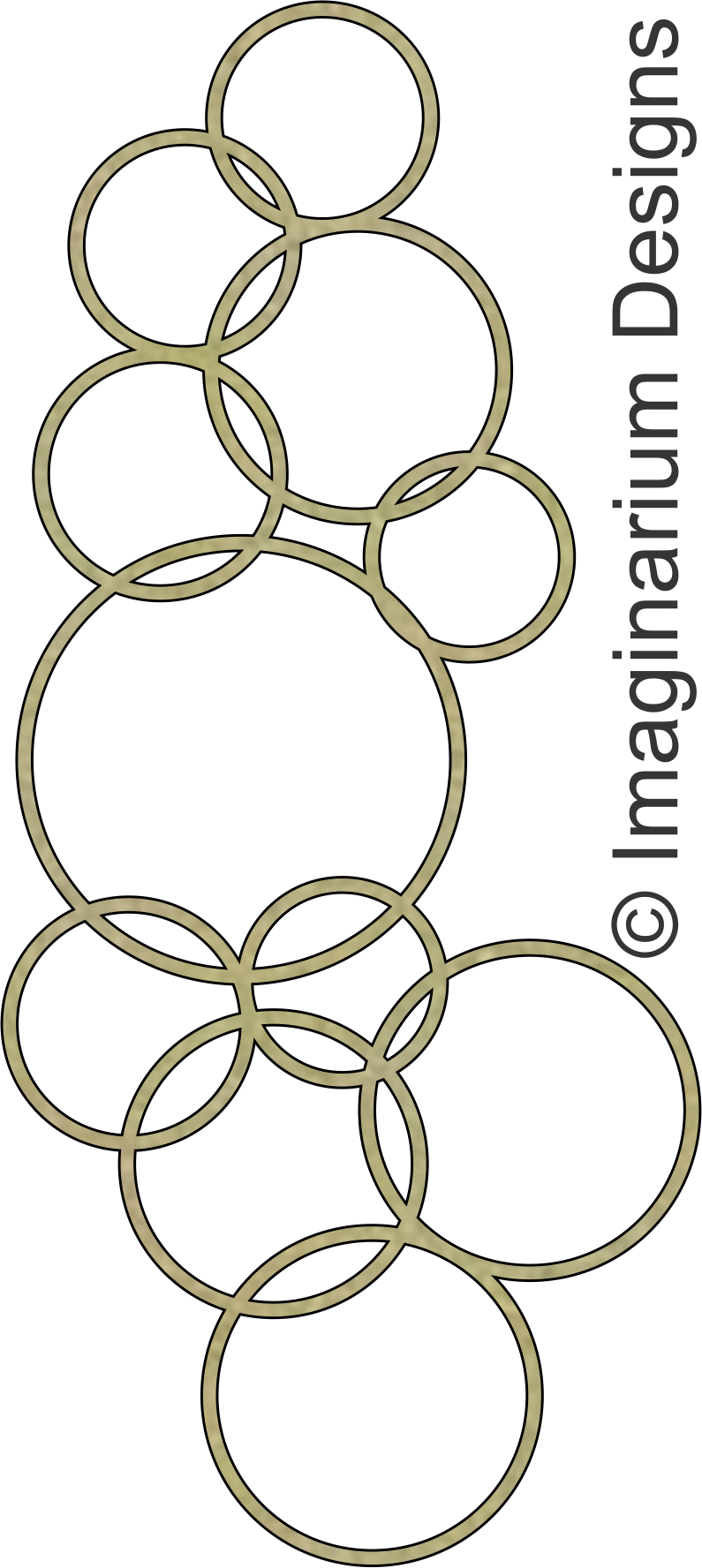
I used two of the 'Nat's Bubbles' chipboard pieces.


The title on my page is also painted black and then I added some white Signo gel pen to the script words.

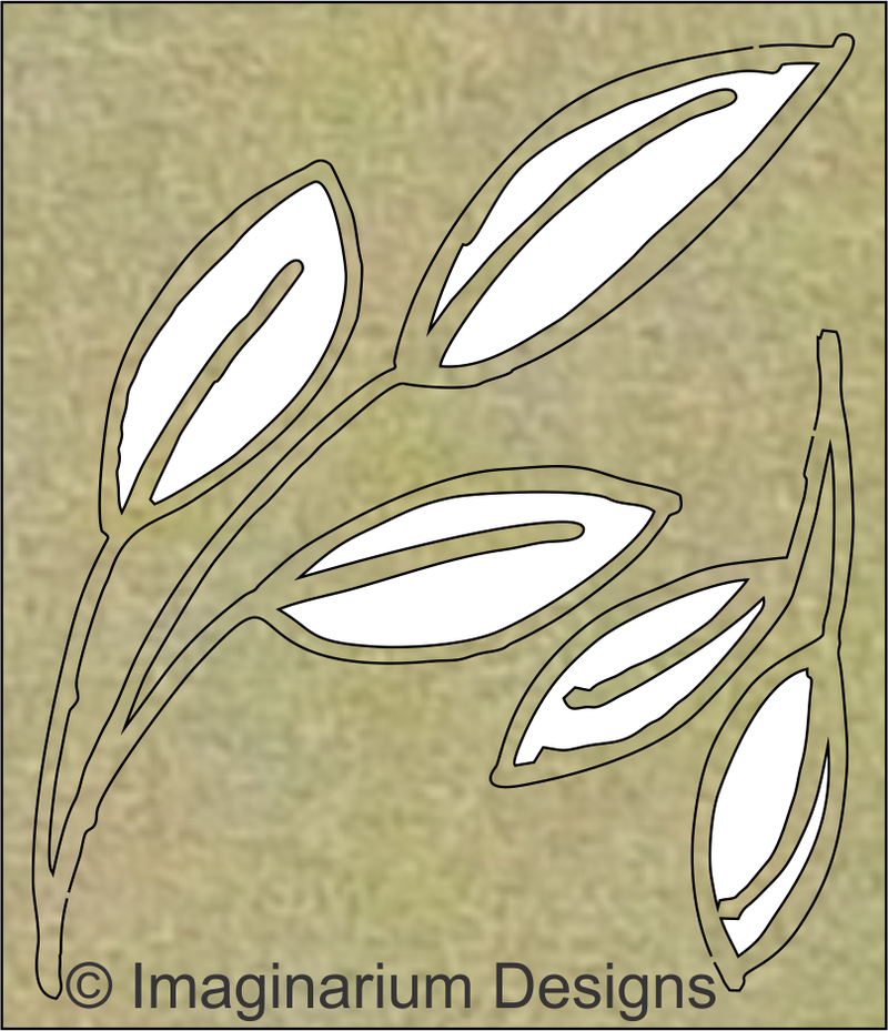
Onto my second page which is a far cry form the bright bold colours and contrast of 'Our Sweet Home'. Instead it's a soft pretty wedding page featuring gold painted chipboard pieces and papers from Kaisercrafts', 'Always and Forever' collection


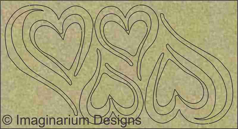
I backed the gold chipboard Heart with glitter cardstock.

So there are my two opposites Bold and Bright versus Soft and Pretty. Which are you more drawn to? I guess photo's dictate a lot where a page is headed but I quite like both.
Don't forget to leave a comment to go in the draw for a pack of Imaginarium Designs chipboard pieces.
Thanks for stopping by
Leonie.

The riot of colors on the bold and bright layout are yummy! The soft and sweet layout is perfection! LOVE the touch of gold! TFS!
ReplyDeleteLove the bubbles on
ReplyDeletethe first layout and
the second is really
pretty.
Carla from Utah