Hello, Leonie here today with two scrapbook layouts to share with you.
Each quite different, style wise than the other.
One is quite simple with lots of pretty patterned papers and chipboard accents and the other heavy with various inks, paints and other mediums along with some funky chipboard pieces. I enjoyed putting both of them together so scroll on to see what I've created.
...................
First up is this simple page using lots of patterned paper by Glitz Designs.
The 'Down by The Sea' title was perfect for this picture of my Sister and I with two of my children
looking out at the lovely beach view before us.
When it came to colouring the chipboard I simply chose colours from the patterned papers that I had used to offset my photograph.
I used chalk edgers and paint, then sealed the chipboard with clear embossing powder.
This lovely vine flourish reminds me of the waves at the beach, don't you think?
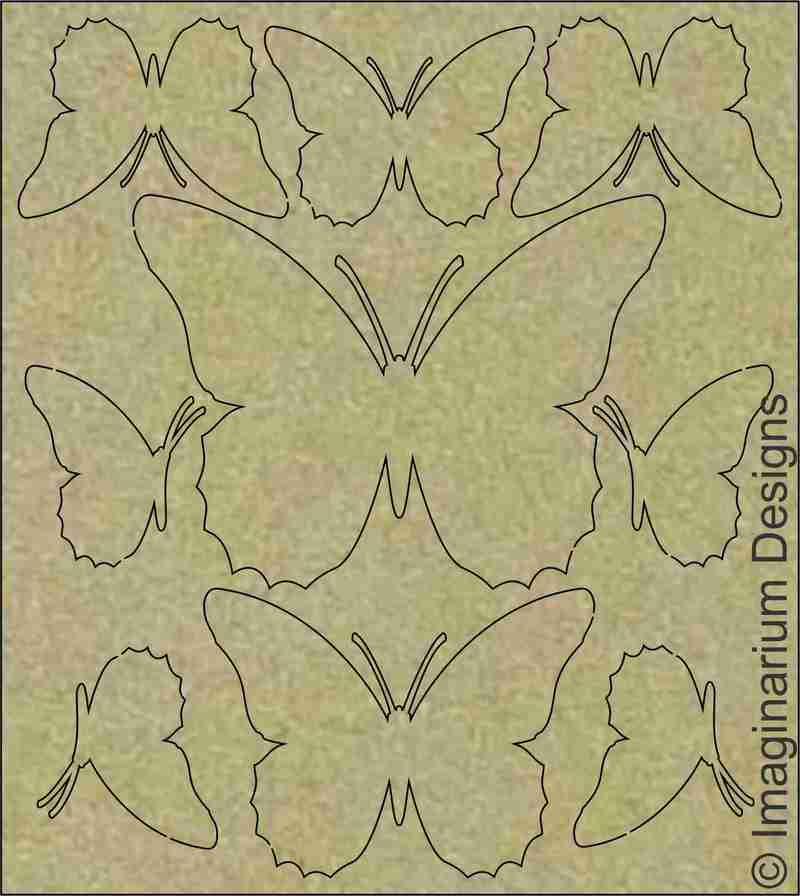
I love the ombre effect on the butterflies. I was so happy with how pretty they looked.
Down By The Sea

Vine Flourish

9 Butterflies on a Board
On to my second page.
This one is using some 13@rts papers and stickers.
I coloured the chipboard a similar green/turquoise to the paper and highlighted it with some
gold glitter in parts and gold embossing powder in other areas.
The embossing powder and glitter added a lovely textural feel to the chipboard and helped lift it from
the base of the layout.
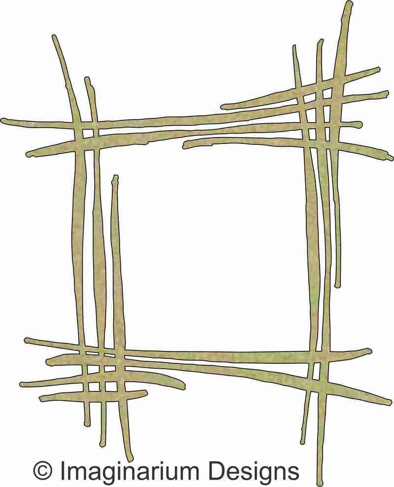
Criss Cross Frame

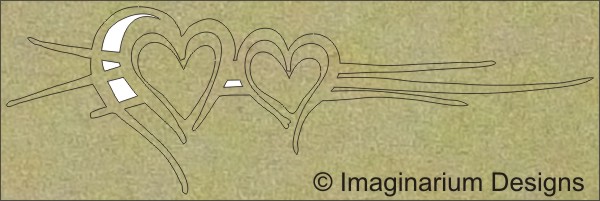
Two Hearts with Cross Flourish

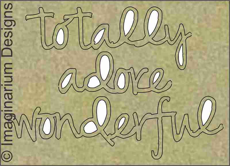
Totally Adore Wonderful

Isobels Upper Case

I thank you so much for stopping by to view my pages.
Hope you enjoyed them.
Don't forget to leave a comment to go into the draw to win a pack of chipboard!
Cheers


BEAUTIFUL pages Leonie!!!
ReplyDeleteLOVE the photo in your 1st layout and how the colours and each and every element compliment the moment - LOVE IT ALL!!!
LOVE the BEAUTIFUL colour combo and EXCITING textures of your 2nd layout!!!
WOW - there is so much for me to learn and try - I'm INSPIRED :)
Very impressed with these pages. Wonderful techniques, colors and layouts. I love the banners on your first layout. I don't usually like banners that much but this one is delightful and I love how you inked the edges. Love the beautiful background and the embossing on the second. The photo arrangements on both look great. Well done.
ReplyDeleteBeautiful work on
ReplyDeleteboth layouts! Love
all the layers.
Carla from Utah